Archives
16
Jan 09
Gunk

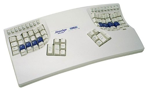
Kinesis Advantage Keyboard
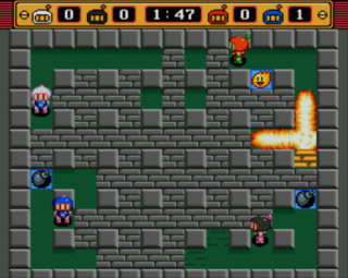
Back when I was finishing my undergrad degree, my final year project (which is a big part of the final degree exams in Trinity) was in Java on a Sun SPARCstation 4 (at the time, one of the more powerful boxen you could get access to as an undergrad). The project was a fair bit of fun, writing a robot controller in Java just as 1.2 was coming out of beta. Lots of long hours were spent in that lab with three or four others working on their projects, and quite a few all-nighters interspersed with the odd game of networked bomberman 😀 I even managed to get a published paper out of it.

Bomberman!
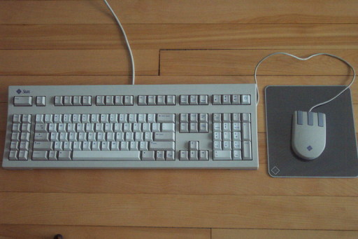
The downside to all of this fun was the Type 5 keyboard.

Sun Type 5 Keyboard
07
Jan 09
Kada2.py output
Ray asked to see what the output of the kada2 script I’ve been working on looks like – only problem is that I’ve been using a real datafile for development, so it has people’s names in it. To avoid any shoutyness, one quick python script to read in the members.kda file and write it back out to test.kda with all the names changed to John Smith; then a quick run with this file as the members.kda file and some imagemagick conversions and viola, the current kada.py output. Continue reading →
